Thank you so much for coming to my feedback blog!
I really really really appreciate you all helping me get it right before I put it out for the rest of the world. This isn't something you have to think a lot about or spend a lot of time on, but the little time you do spend helps me very much. I hope it is fun for you and not arduous. If it is arduous, buy all means don't get involved!
Compensation details: On the docket and in need of feedback in the coming weeks are new hang tags and my 2007 Holiday Season Major Drawing Product Giveaway And New Product Naming Contest (and maybe something else). Your honest, clear feedback is very valuable to me. If you can get through it all (and I hope it really doesn't require much effort on your part) I'd like to send each of you a brand new
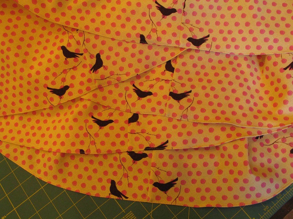
HotHolder of your choice* and a kinda-last-year-but-still-adorable coaster = a $30 value
or a 4-Way-Entry-Bag (great for clothespins) = a $46 value. What ever part of these projects you comment on, I'll send you something for your efforts. If your household is already inundated with
HotHolders and the like, think of giving them away to a friend or deserving relative and you have that much less shopping to do.
Sorry I'm so wordy!
Here's the first project for you to comment on:
This is a draft of what will be my new full color "mini" postcards. For some reason, when I upload it in color it appears in the negative (not pretty!). The B&W version below is the one to inspect. These are not intended to be mailed. They are to give out at shows and to interested parties. I'm designing and ordering them as a 6x4 postcard. I'll then cut those in half and have two styles of minis. I do have traditional size business cards that are black text on white, just the contact info thank you very much, suitable for the rolodex. Some day I'll probably order postcards for mailing out, but that's a different project.
my objectives : These "minis" are intended to be an attractive, informative token. They are intended to give more info in image and text than a biz card. I want folks to know my wares are handmade by me, an idea of what they look like, what they are made out of, that they are
eco-friendly. I also want to give folks some way to contact me and learn more through my website and blog. I'll end up with two different styles and I like that: 2 diff pix, I'm pretty okay with one having full contact info and the other not - but I still want your input on that issue. I will be able to print stickers listing my holiday vending schedule to put on the back of the cards.

You can click on the image to see it bigger. (I'm going to be working on getting rid of the white around the
HotHolder) You can give me your feedback by leaving a comment on this blog (signing in using your
google account i.e.
gmail, or creating one) or emailing comments to me at
sarahogreen@gmail.compoints I would especially like feedback on:
1. "sustainably handmade" is not part of the name of my business. It's a descriptive phrase, used instead of "
eco-friendly." Is this clear or confusing along the bottom of the card in bold? Should it be in the text only like the top version? My spell-check doesn't always recognize "sustainably" so maybe it's a made-up word, but is it easy to understand what it means? Is it better in the text or at the bottom? Both okay?
2. Should I always include my full contact info incl street address or not? it takes up a lot of space. why would folks need my street address? they can get if off my website. Is it okay to have a version of full and one of not?
3. the text:
a. Am I trying to say too much in one breath? Is it a run-on sentence? (it's not even a full sentence, I know...) But is it confusing? basically understandable? If anyone would like to throw some alternative wording at me, I'd love to see it please.
b. "using" or "from?" as in "...created by Sarah O. Green using/from vintage..fabrics."
c. Is "delightful" the right word? any other suggestions?
4. At the bottom of the top card: Should I say "featuring" or just have "
HotHolders" and the slogan?
Thank you for helping me with your comments!
in gratitude and with affection,
Sarah
* you can see the latest styles of
HotHolders on my other blog
http://www.mountainashdesign.blogspot.com/I also have Los
Ninos, little flying/fleeing bulls, vintage fabrics and more. If you see me over the next few months you can pick one out yourself.